More Work
Art Direction
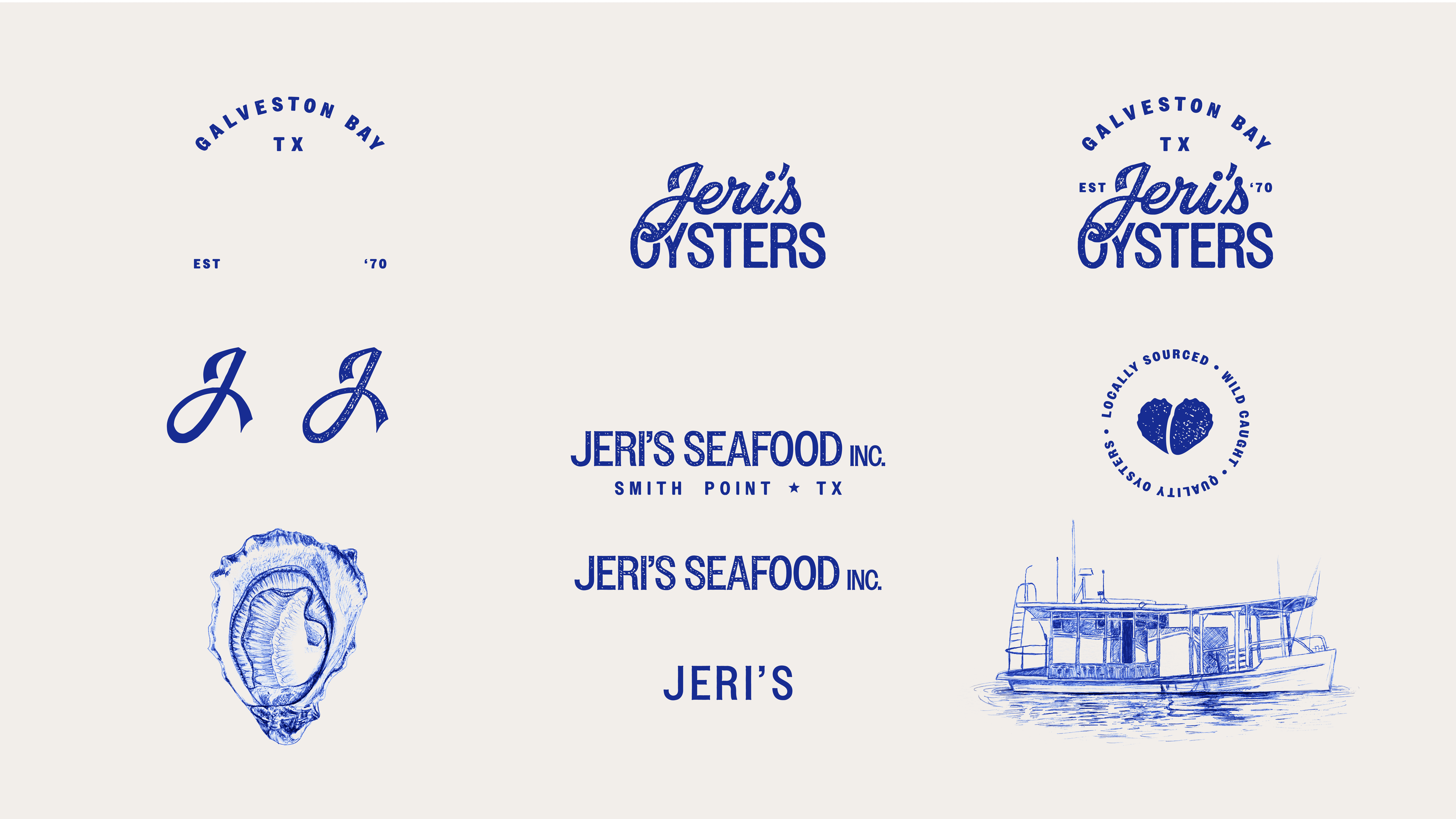
Branding
Illustration
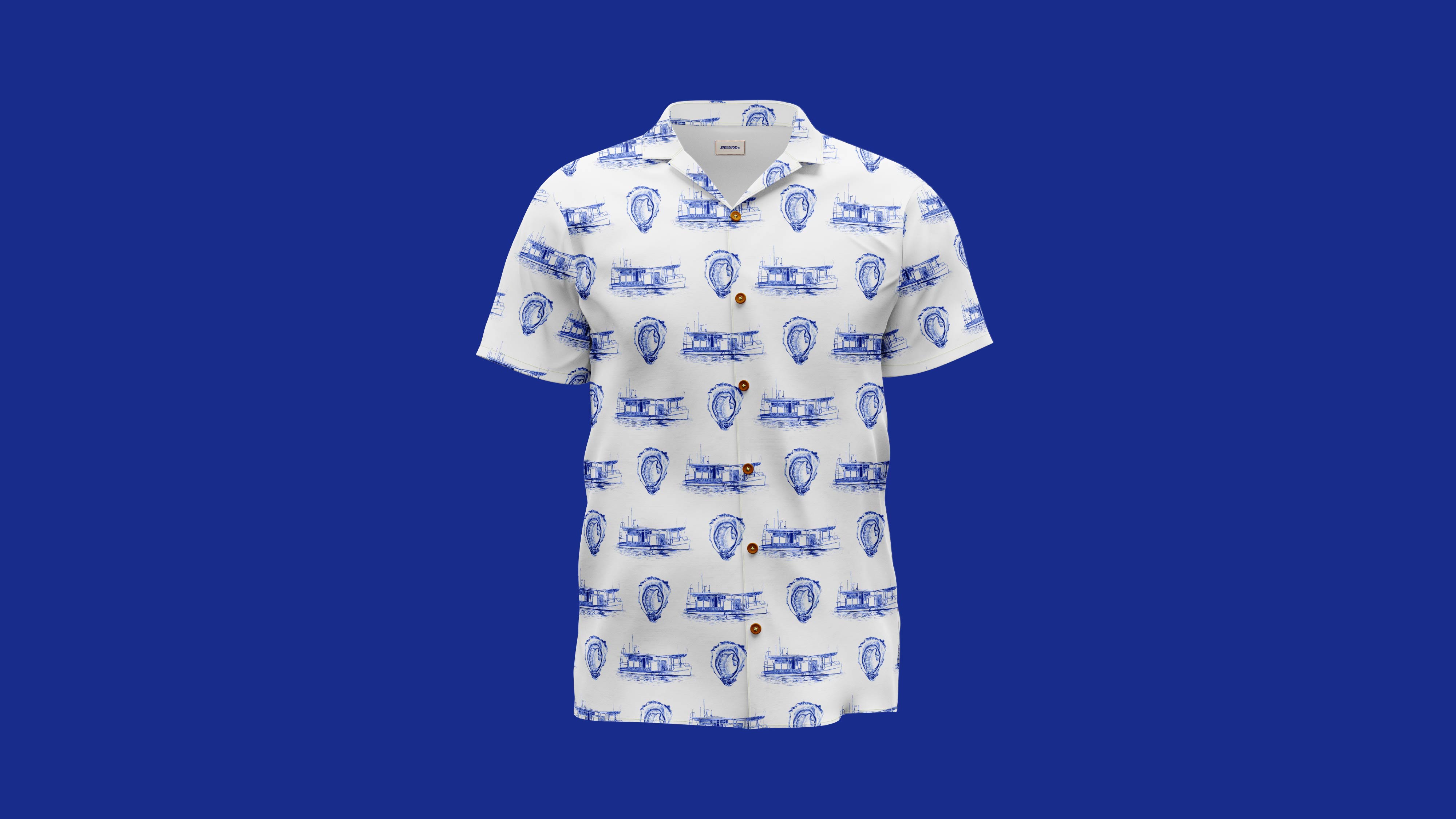
Merch Design
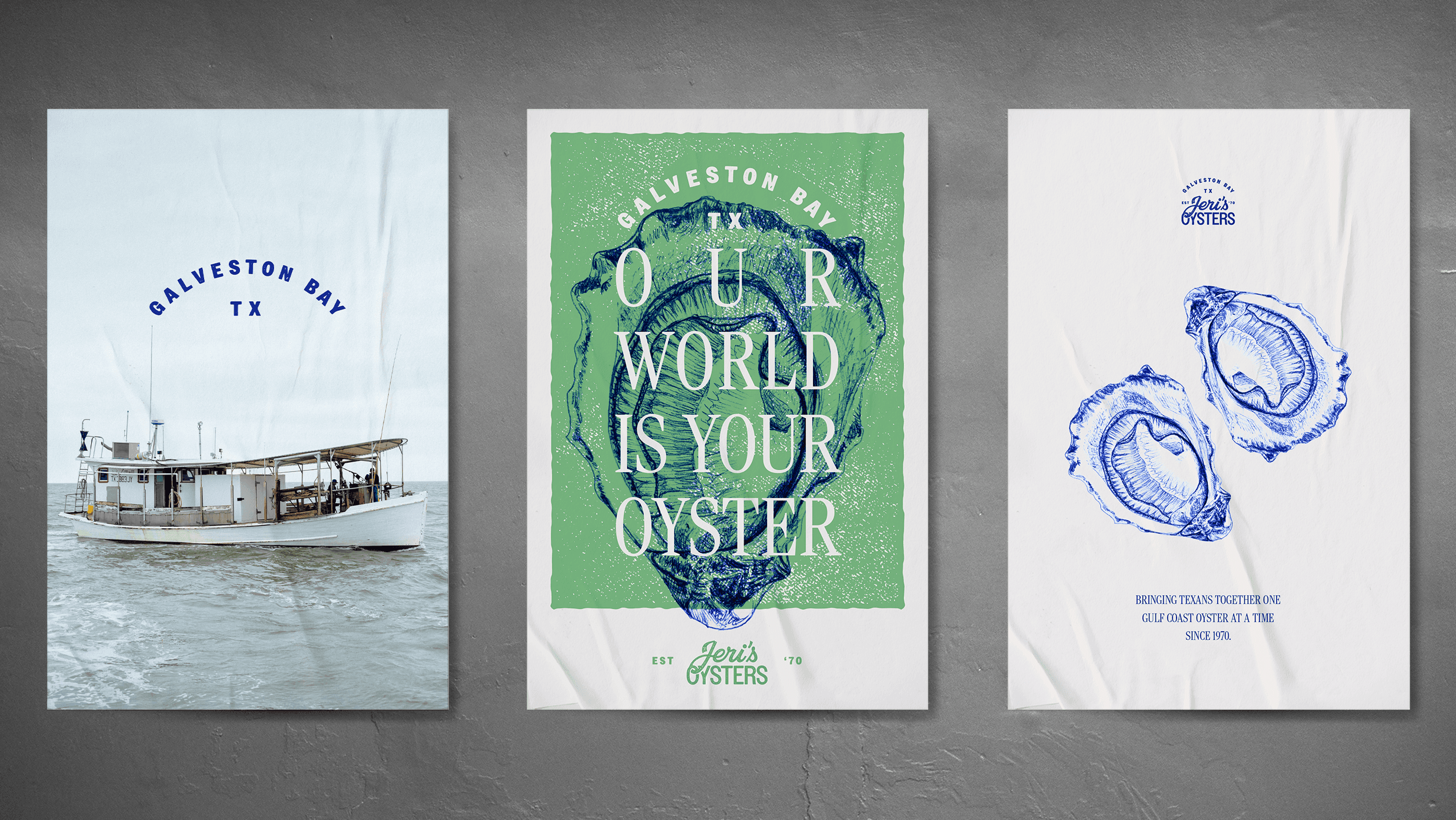
Package Design
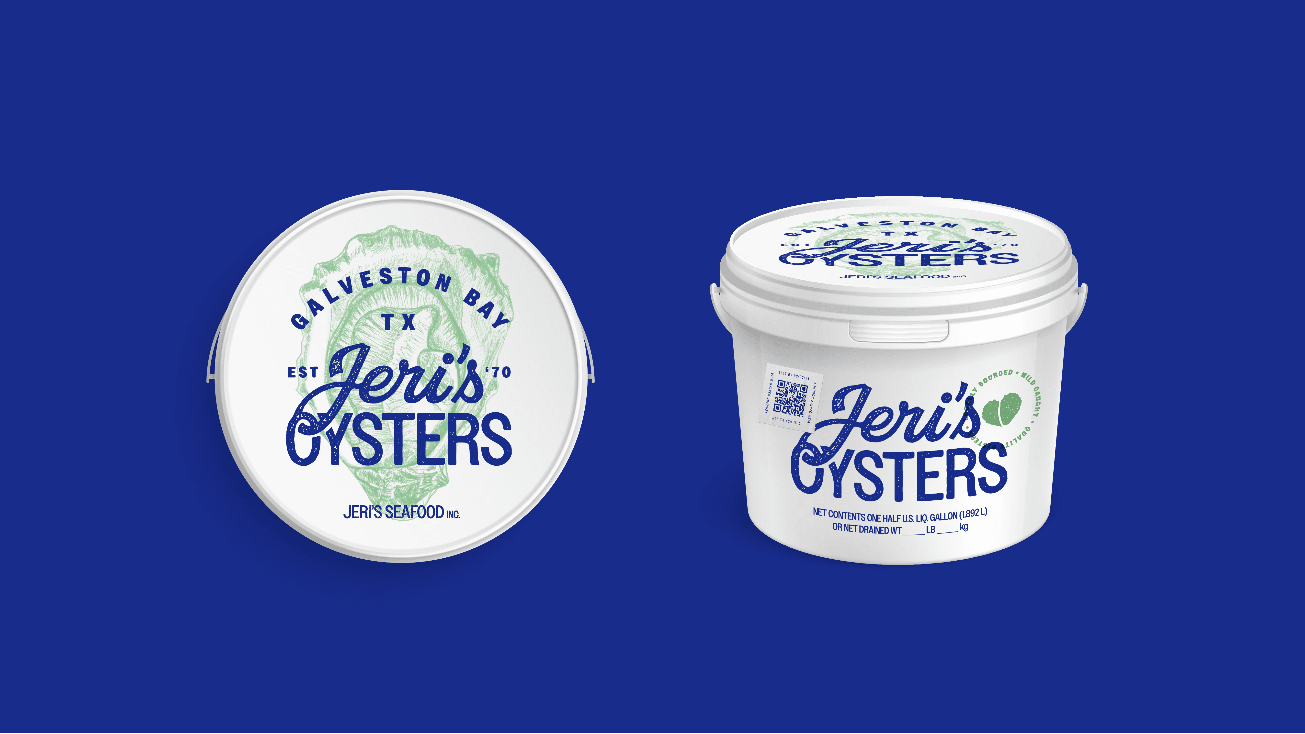
The Brief
Revitalize the identity of Jeri’s Seafood, a family-legacy operation harvesting Galveston Bay oysters since 1970. The rebrand covers both the parent company and its consumer line, Jeri’s Oysters, currently sold wholesale and in HEBs statewide. Leverage the local aspect to communicate freshness, and make it feel like the three-generation family-owned and operated business it is.
The Execution
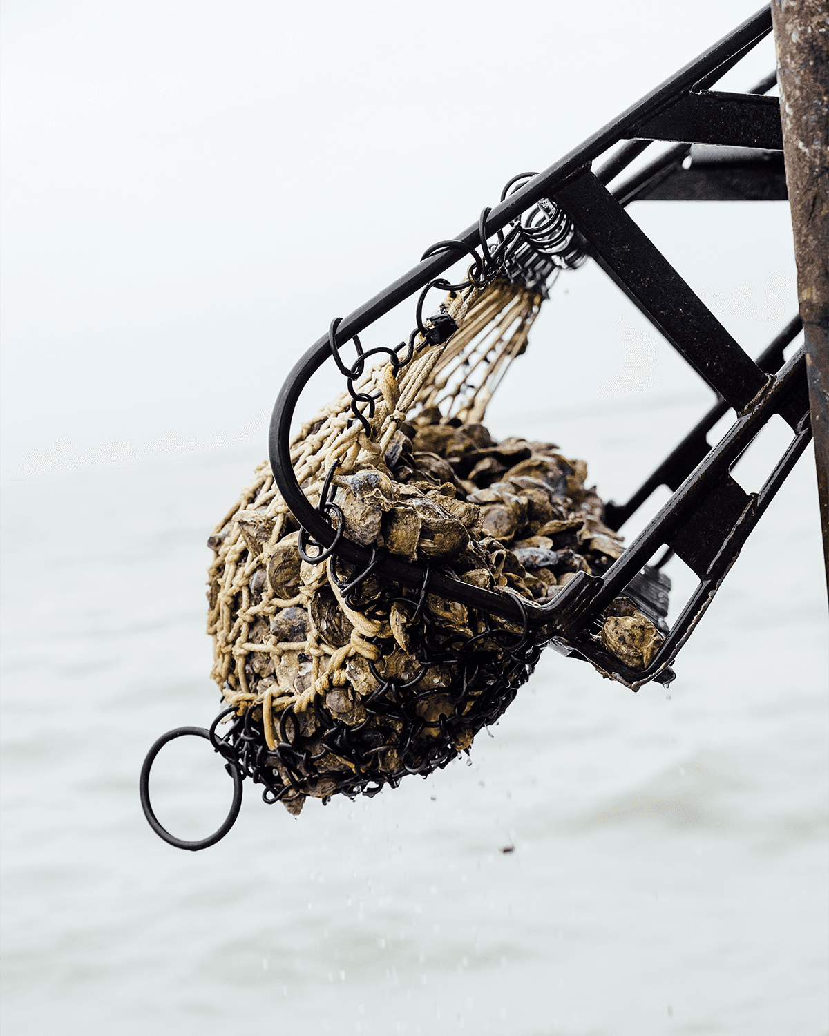
Selling Jeri’s as a teenager while working at HEB, I remembered Jeri’s Oysters for their monochromatic blue packaging. I knew it had to be preserved in some way out of respect for the brand’s history and to maintain brand recognition. With the primary color locked down, I busted out my blue ball point pens and illustrated the logotype and design elements. To bring it all home, I art directed the photoshoot highlighting the hardworking Texans who dredge every oyster with care.